
The design of a good landing page is crucial – when it is not adequate your business can have trouble with conversion rate and getting new clients online. It is your company’s virtual business card and its design should reflect your purpose and meet your potential clients’ needs. That is why remembering several best practices can empower designers and help them create the digital product that will serve your business better. Let’s dive into several proven strategies that clarify value and trigger conversion on your website!

Landing Page – what is it?
The main assumption of the website is to get the first leads (acquiring first contacts with the client) using the information contained on the website, we lead the user to our contact details for purchasing the product, subscribing to the newsletter, etc. We mainly try to convey the most important information about the product, the service we want to showcase on the homepage. The simple way of navigating the website and quick access to the information you need is a plus here. Most landing pages are similar, so the challenge is to create a website that will stand out from the crowd yet still serve its purpose.
KISS rule (Keep it Simple, Stupid)
When designing the website, it should be taken into account that the user is very easily distracted by the elements contained on the page, be it animations or simple graphics. Minimalism, simple graphics that do not collide and do not distract our attention from the information contained on the website will be a good solution. When designing a landing page, it is worth sticking to certain rules. If we have them, it will be easier for us to present the content on our website and convince users to take the actions we want them to take.
Interesting Headline or Page Title
Usually, the first thing the user sees on the website will be the headline, it is good practice to provide the most valuable information about our product in this section to interest our client. It’s worth spending some time refining what is there. Think of what will attract your potential client’s attention at first glance, what are their needs, what are their pains, you can meet with your product or service.
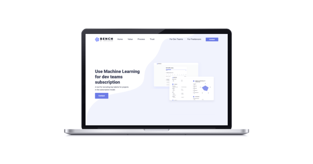
Quality photos and graphics
Use the best photos or graphics taken by yourself for the website, not downloaded from free stocks, because most of them are available on the Internet and can be used by your competition. New, unusual elements not made artificially will surely attract more users to browse and scroll through the website. Of course, all elements should be well optimized because we cannot afford the website to load for a long time. Moreover, it can also be beneficial for your website’s SEO. Visual content best presents a given product or service, but you have to remember not to overdo it and the photo, the graphics, or even videos did not distract from the rest. Everything has to be in harmony.
Call-to-Action is a must
After the user reads the information on our website, there should be a button with a call to action that will take them to the target of a given product or service, e.g. purchase, booking, form, etc. This button should be visible and easy to notice. A visible button of an appropriate size, well-integrated into the design of the website is a must. Catchy text on the CTA button should attract the users’ attention and effectively inform them about its purpose. If your landing page is longer, you can place the call to action button in several places.
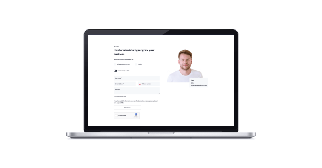
Contact form
This is where potential customers enter their data. It is best if the form will not overwhelm the user with the number of fields to be completed. The shorter, the better. The potential customer will not want to leave too much data, so it is good to think about the amount of contact information that we want to obtain (it is also relevant from the GDPR point of view). Website visitors are reluctant to disclose their details to an unknown brand. Therefore, it is a good idea to provide information about web security. For example, a link to the privacy policy that should be added to your form can be placed just below the contact form.
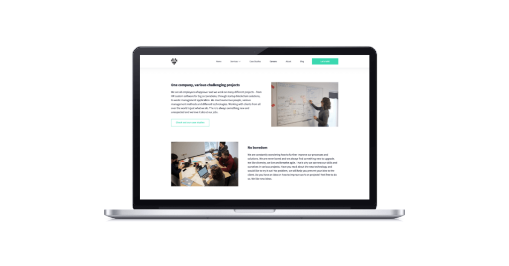
Content
The content is an essential element of your website. Thanks to it, the user learns about your product or service. It is good practice to provide the client with a pleasant way of reading it. We do not flood the user with a wall of text. You should place only the most important information on the page, divide content into short chunks. Have a copywriter write the text if you are not familiar with the content writing. Your product should be well described, otherwise, you will not convince users of it. Include testimonials as social proof of your services. Moreover, a good landing page should be well-optimized for SEO to make your landing page more easily found in search engines.
What is more, remember that most users just scroll and skim the content on your website. So any design elements that can catch their attention should be incorporated into your content. You can use:
- bold text
- italic text
- “citations”
- visual elements, like little graphics next to each point
- tables
- bullet points 😉
- or many, many more.
Responsive website
Most users nowadays use phones, so some of them can get to the site from smartphones. It is a must for the landing page to look good also on the mobile version, despite the mobile device your potential customers use. I believe that the mobile-first approach should be the one you go to when designing your landing page.
Contact
Do you want to find out more about landing page design?

What happens when designers fail to follow design best practices for a landing page?
Your customer will not find relevant information. Your metrics will not drive your business growth, your clients will have trouble contacting you. That is why you should take this list of tips to heart and follow design principles while thinking about the landing page. Moreover, bad design can discourage users from cooperating with you. Your landing page should reflect your business, it is all in all your virtual business card and it should serve its purpose.


