
More and more shoppers are turning to online stores and mobile shopping instead of going to the mall and wasting their time. By 2025, the global online retail market is estimated to reach $7.385 trillion, indicating that online businesses are starting to profit with borderless e-commerce. These days, competition in the eCommerce market is tough. Many companies offer competitive prices and fast delivery, so user-friendly customer service and a well-thought-out interface are some of the few factors that could help you stand out. Remember – poor UI/UX design of your product can lead to sales failure. Sometimes it’s the little things that stand out the most. Those small flourishes and finishing touches make your mobile device customers smile.
In this article, we’ll give you 6 UI/UX tips to help you increase your conversion rates and drive customer-centered UX.
1. Put all critical elements in the thumb-friendly zone
Smartphones available on the market are getting bigger and bigger. Proper placement of elements encourages users to take specific actions. If it’s not developed correctly, this can complicate the customer’s journey. Reaching the top of the screen with your thumb while using the phone with one hand is difficult, even for people with very long fingers. Therefore, it is worth placing all the essential functionalities at the bottom of the screen. For example, add-to-cart or payment processing buttons are specific elements to consider placing within a comfortable reach zone.
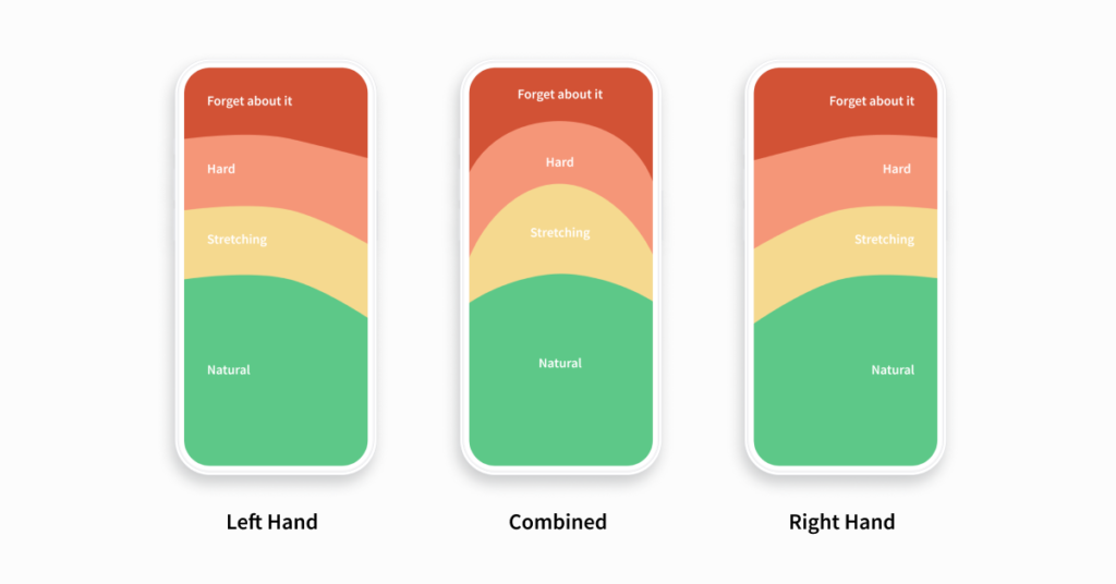
This graphic has been known for ten years in an almost unchanged form. However, placing a hamburger menu and searching on mobile pages’ top bars is still prevalent. While the menu dominates applications at the bottom of the screen, pages displayed in mobile browsers do not necessarily follow the principle of placing popular options within reach of the thumb.
The principle of “accessibility of elements for the thumb” is fundamental in understanding how the best product pages, searches, and filters are designed. It doesn’t mean, however, that you should always focus on placing all available options in one place at the bottom of the screen. It is worth selecting the most popular paths or ways of navigating users on the designed website and enabling smooth and convenient one-handed operation without changing the phone’s position in hand.
2. Guide new users and reduce frustration
One of the most critical aspects of an e-commerce application user interface is making your shopping experience pleasant and hassle-free. Reducing the number of choices is an excellent way to ease someone through a process. Have you ever been paralyzed by choice when confronted with an extensive menu at a restaurant? You’ve experienced the paradox of choice, that the number of available options can have positive and negative consequences on usability.
But obviously, don’t make it too simple. Too little information can reduce the education required on what to expect, and no choice can quickly end in a single-option-aversion-land, and no one wants to be here.
While microinteractions and prompts are a great way to surprise new users with helpful functionality, some elements have become so expected that they can frustrate users when your app doesn’t include them. The most common cause of user frustration happens when it’s unclear what to do next. One example is the feedback Added to the cart or Added to favorites. When shoppers tap the “Add to Cart” button and nothing happens, it can lead to confusion about whether the action was successful, repeating added products, and frustration at the checkout.

3. Avoid long sign-up and checkout processes
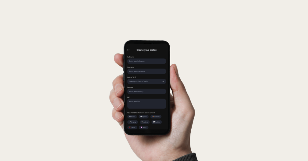
Never ever ask your client to sign up before you need their personal information for the checkout. Even if you ask him for details during checkout, keep it as simple as possible and only ask for the information you need to fit on his smartphone screen without scrolling. Most people find that a multi-page signup and checkout process is frustrating. They just don’t have the patience for this, especially mobile application users. What’s the usual result? The result is usually abandoned carts and your lost profit.
So why not consider social networks as tools? One-click and registration in the app through your Google/Facebook profile are complete! Your customers will appreciate saving time!
For a flawless payment experience, use the autocomplete fields and let users quickly modify their orders. For example, it would be helpful for the user to change the product number and size before finalizing the purchase. Using autofill fields also helps increase conversion.
4. The app’s design consistency
Consistency is one of the most common mobile app design tips. All the elements of your eCommerce app design should look and work the same way. To maintain this fundamental design principle, consider three parts that come into play:
- Visual consistency – typefaces, color schemes, and interactive elements should look similar on all app screens.
- Functional consistency – interactive design elements should work the same way on different screens (e.g., buttons).
- External consistency – all the products (website, mobile app, other products) should have similar design patterns.
The consistent design allows the creation of a logical structure and prioritizes the content, highlighting essential elements of the design. Moreover, the uniform design makes your app predictable. Users don’t need to learn new ways of interacting with your app. The more straightforward the interface, the easier it is for users to find the product they want to buy in your app.

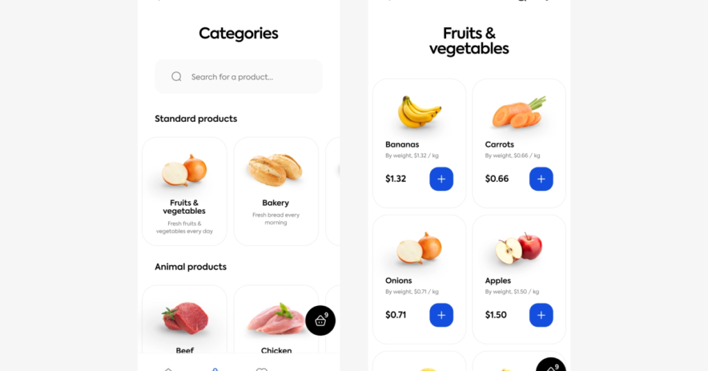
5. The three-tap rule
When designing a mobile eCommerce app, the UX structure should take no more than three taps to get to a product. The three-tap rule says: it should take no more than three taps from a user to get to any of the products he wants to buy.
To meet this requirement, you can arrange your products in the following order:
Categories -> Sub-categories -> Products.
In addition, you can use tags to organize your products into categories such as “Bachelorette party,” “Valentine’s Day,” etc.
The search bar is also an essential element of the UX design of mobile apps and websites. It helps users get directly to the product they are looking for. If you want to provide even better functionality, consider Smart Search. As users type their first letters, several options and suggestions will be displayed for them to choose from. In this way, you will not only save users time and improve their journey, but you will be able to show some hot picks up front.
6. Navigation is the most crucial element
The key to improving your eCommerce mobile app is perfecting navigation patterns. It can create a natural flow for users to make more purchases without feeling overwhelmed or unsatisfied. Your users should be able to intuitively explore your website or application and complete all critical tasks without any help or prior explanation. One tip for enhancing the navigation experience is to use standard elements. It may be tempting to stand out and create something unique, but navigation patterns aren’t the best place for exercising your creativity. Furthermore, making the navigation options visible is critical so they can see them. For example, if it’s a side menu, users should see what they can call it. Using different colors, you can also make certain navigation elements (e.g., the menu button) more visible. Moreover, you can prioritize navigation options using different colors (for example, to mark high-priority options with lighter shades).

Contact
Do you want to discuss the implementation of best practices into your e-commerce app?

Mastering the challenges of eCommerce mobile app design
Research says 76% of users will switch to a competitor if they face even one issue with the app, which means there is absolutely no room for a single mistake. Alongside the top 6 tips for UX design listed here, there are plenty more ways to enhance the overall user experience. Experimenting with new design features and testing for efficiency can have several benefits.
To create a compelling UI, you need to understand how customers use your app and how they experience it. The best, most unique UI elements are how your app makes customers feel — amplifying positive emotions and smoothing over negative ones.
Designing an eCommerce product can be tricky, but now that you know the most important UX/UI design tips for an e-commerce business, you have everything you need to design an app that looks amazing and converts like crazy.


