Is dark mode healthier for your eyes?
The answer is the same as for many issues related to the impact of devices on us – it depends. For years we have been accustomed to reading black items on a white background. Many studies indicate that the dark background option is more beneficial to our eye as our eye gets less fatigued scanning long texts. When using dark mode, much less irritating light enters the eye, but small content may become blurred by dilating the pupils. A study on the health aspects of dark mode, conducted by the ophthalmic company RX, found that:
- dark mode can reduce eye strain in low-light conditions,
- 100% contrast (white on a black background) can be harder to read and cause more eye strain,
- it can be harder to read long chunks of text with a light-on-dark theme.
So it can be considered that dark mode is a kind of extension to make the phone easier to use, not a cure for users’ eye problems. It should be used in certain situations, but users do not always choose this matter. Dark mode will be most beneficial to people who frequently use their devices in low light conditions. On the other hand, it may be disadvantageous for people who use the computer only during the day and without changing to bright mode.

Why the hype for dark mode?
Let’s move to 2019 and the Google I/O conference. Google declares that a revolution in material design will introduce dark interfaces and then define their rules. Dark mode begins to flood forums, discussions, and products whose interface converts to the dark mode or has its additional option. This is hardly surprising. Black is associated with elegance, mystery, power, and sophistication – it is timeless.
Is this trend really worth noting? Yes! The move away from bright interfaces, in my opinion, is a brilliant shot. Not exclusive, of course. Partial departure from bright interfaces increases accessibility and comfort in use at different times of the day. However, it requires designers to be surgically precise in their projects due to the high risk associated with a number of the limitations related to dark schemes, which most often connect to color palettes.
When to opt for a dark background in apps?
It’s impossible to say who definitely should opt for a dark app UI. However, it is possible to present who did it right.

The graphic on the left shows the first version of Netflix from times when streaming was unheard of. Nowadays, the service looks completely different mainly because of the light, dark design used in the application. I personally use Netflix in the late evenings, using my TV. I can’t imagine using a much brighter application in such circumstances. So, in my opinion, this is a change for the better.
Is dark mode necessary for your product?
The increasing use of dark mode by users has caused applications projects to expand with another issue. Designers are facing the question of whether the product should be designed in light or dark shades. Using the latter is not always a good idea, and each project should be approached individually. Creators should consider many factors when deciding this question. One of the keys defining the work of each project is its category. Many enthusiasts of this approach may oppose my opinion, but dark mode should not be used on “complex screens.” What does this mean? Speaking of dark interfaces, I will refer to books with which the halation effect is associated. This is a situation where bright elements on a black background cause the text to blur in the eyes slightly. That’s why using extensive text typesetting on dark interfaces is so strongly discouraged.
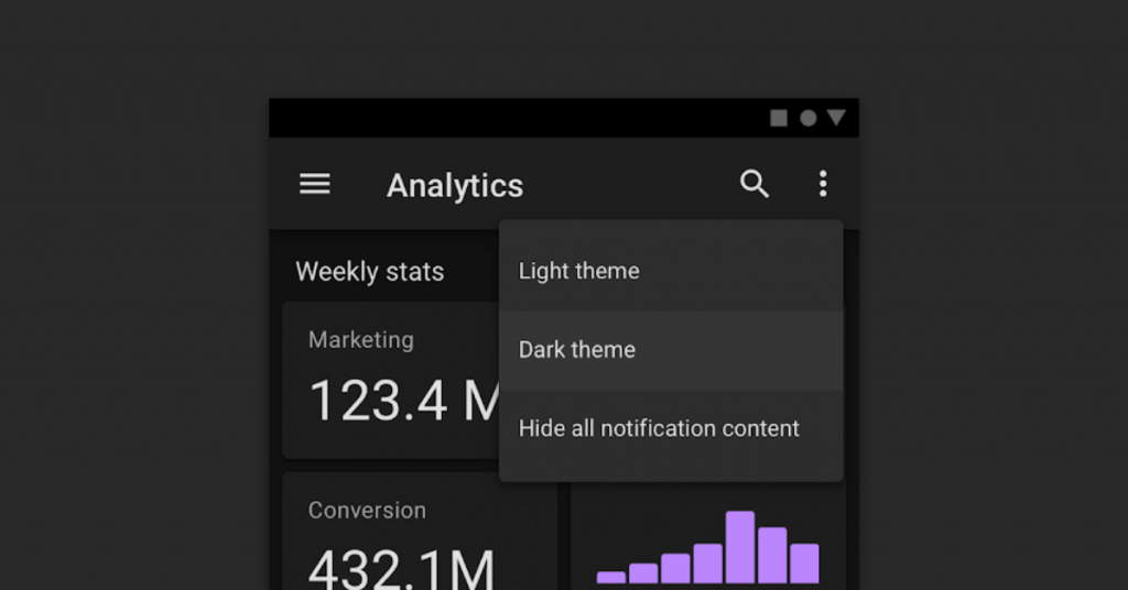
Dark themes reduce the luminance emitted by device screens while still meeting minimum color contrast ratios. They help improve visual ergonomics by reducing eye strain, adjusting brightness to current lighting conditions, and facilitating screen use in dark environments — all while conserving battery power. – Google Material Design
Pure black
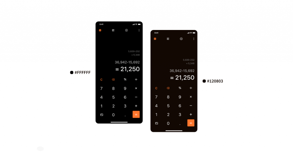
What to think about pure black in dark mode use? As many designers as many opinions. Pure black helps to save batteries in the phone, but it closes a valuable field for building a color climate of the product from a design point of view. I rely on shades of black and white when creating color palettes derived from the primary color shade but are not 100% #fff or #000. Details make a difference. What will be simply black to the casual user is actually a softer shade of that color and this will build a cohesive design. Is it worth avoiding pure black? Not necessarily! Think about what your product needs. Apple uses pure black when composing its system screens, while Google usually relies on #121212.
Color selection
Are you familiar with the HSB color palette? If not, then surely you know what HEX is. HSB is nothing but HEX expressed in 3 values – Hue, Saturation and Brightness. For example, the slider from the left saturation is 100. However, decreasing the saturation, we will get a brighter, clearer color as hues will be directed towards white. Manipulating the HSB palette is worth considering in any composition of the color palette for your products. It makes a great deal of the work easier early in the process.

Facade of colors
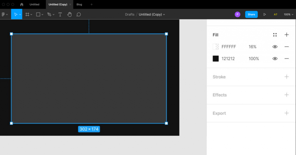
Contrary to light interfaces, we cannot use a shadow on dark background in dark mode. Of course, we can slightly emphasize a given element with shadow, but it is not enough when all the aspects oscillate around the darkness. In such a situation, choosing the correct facade is a rescue. Elements that are higher on the interface get a lighter color.

Protip:
Google recommends that elevations be created using a color layer overlay. In Figma, it presents itself this way:
Accessibility
An essential point that cannot be omitted when designing screens in any color version is availability. A prevalent mistake is the use of white. Contrary to appearances, it seems logical to place color #fff on a dark background. Nevertheless, it is a mistake.
Text in such colors will strongly contrast with the whole environment, which may cause, among other things, a halation effect. A much better move is to keep the white at 80%. Then it will fit better in the whole application without losing its visibility. Of course, moderation should be exercised. If you get to the level of mixing black with gray, you should be careful. In such cases, it’s good to have a contrast control plugin on hand. My (Figma user) favorite is Stark, which checks that all elements will be visible to every user.

Give users a choice
Not every user has to like dark mode. There are exceptional situations where the black method is related to the brand of the application owner, as in the case of Netflix. On the other hand, if the client’s branding is neutral and dark mode is not necessary, it’s worth suggesting that the user choose an interface style that meets their expectations. It will improve the perception of your design as “tailored to each expectation.”
The most common mistakes designers make
- Ignore accessibility
- The dark mode is just a color reverse. Nothing could be further from the truth. Screens made darkly are not black and white swapped in place. To create a dark mode without forgetting about risks and aspects, you have to think individually about the color behavior with many elements. Otherwise, tiles will get a white shadow, and we don’t want that.
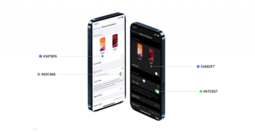
- They are using deep colors. While it may seem even using Apple devices that the colors they use are almost identical, this is just a clever play on our perception of colors in different environments, for example, below.
My favorite dark mode in practice (already in use)
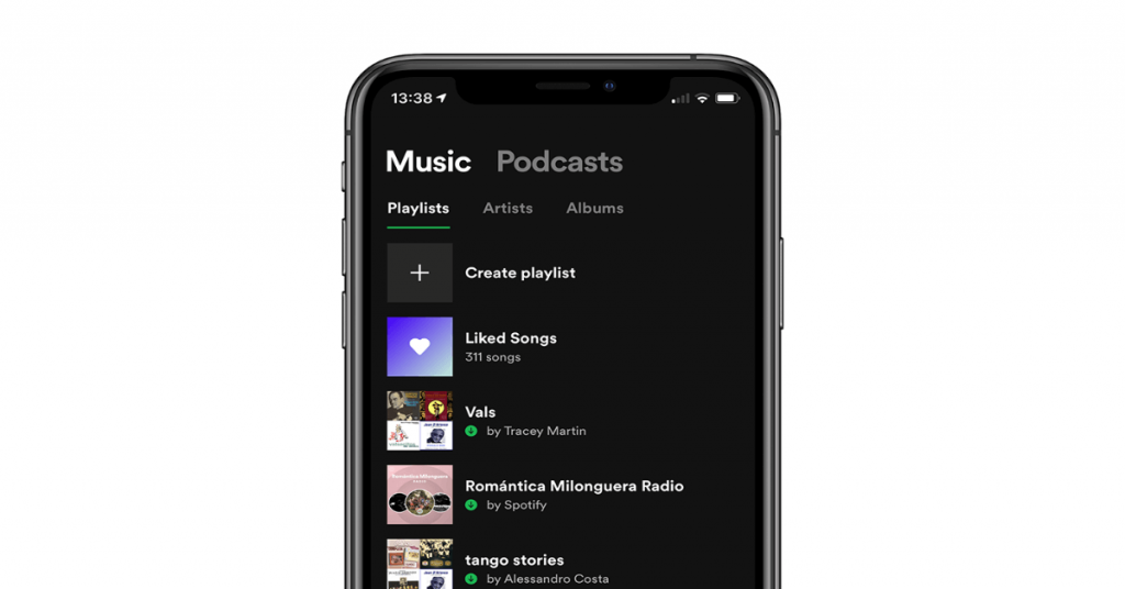
Spotify
Netflix

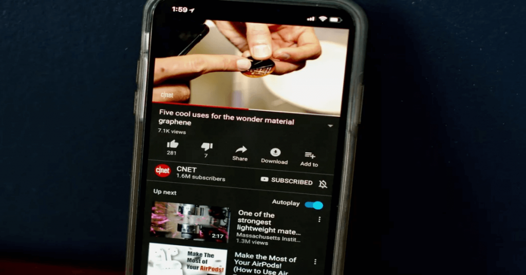
Youtube
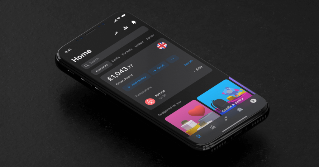
Revolut
Contact
Do you want to find out more about dark UI?
Know dark UI design best practices
Dark mode, as a relatively new trend, has permanently established itself in design. Nowadays, creating an application whose primary purpose is to satisfy the audience’s needs, it is impossible not to guarantee a choice regarding the interface colors. However, during the design process, it is not worth focusing only on the shade scheme layer, if you’re curious to know more examples of the do’s and don’ts of mobile app design I described them in my previous blog post. After learning all the tips, designing can be just a pleasure.

